
Men’s cosmetics packaging: Sober
Optimum compatibility and maximum effect.
These are the key ingredients to the success of the Berlin-born brand - Sober.

Sober - the functional solution for men
The German brand had the vision of creating a product that would fill the gap for male cosmetic products in the market. With this in mind, Simon Schier and Philipp Roth created a line of cosmetics for a modern man.
Products of Sober were developed effortlessly. The founders believed in an honest-to-nature way, to provide proper skincare solutions for men.

The formula of Clean Care
While Simon and Philipp were researching the market, they felt the need to develop their own formula. The two created products that target problems specific for men; protect, regenerate and counteract skin ageing.
Simple, yet effective.
"After years of" digital "work we have noticed that we're not getting younger. We wanted to create a real product that we needed and wanted to use." - explains Phillip.
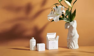
Sober’s range of products includes face creams, serums, cleansers, repairing agents, and perfumes that support their Clean Care philosophy. They also promise that all of these products are free from artificial substances, like parabens, petrochemicals, PEG-based polymers, artificial fragrances, and more. None of Sober’s cosmetics is tested on animals, which also stands for the brand’s core values.

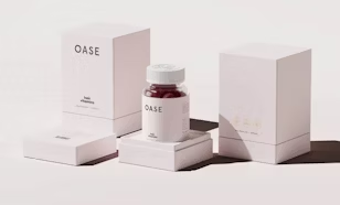
Products based on honesty and minimalism
Simon and Philipp envisioned Sober to be a minimalistic brand in every aspect. From the product development all the way to the packaging design. They wanted to keep a well rounded and coherent style - a sober image.
“We stand for the value of good design. We consistently pursue the path of responsible, ecological and conscious design of our products. Form and function stand for high quality and concentration on the essential. Our goal is timeless design, simple and practical in use”.
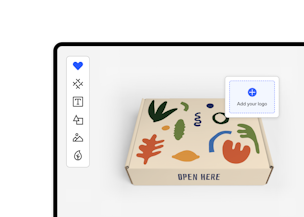
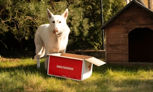
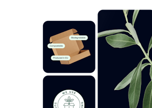
Sober created a simple and elegant design, by using an Eco Mailer Box with their logo candidly placed in the centre of the box. This design keeps in line with the brand vision; effortless and effective, but also making great use of minimalism.
"In our opinion, quality and the value of design are expressed by the fact that form and function are very clear to us at first glance. For the year 2020, we are nominated for the German Design Award. It honours innovative products and projects, their manufacturers and designers who are pioneers in the German and international design landscape," says Simon about his company's design idea.

Unboxing Experience of Sober Berlin
The intended choice of packaging led to an even bigger picture beyond the box, the unboxing experience. After opening the packaging, the customer will see on the packaging wing the inscription: "Good things await you" and the #staysober hashtag. This attracts attention to Sober’s social media, maintaining the coherence of the brand across all channels.
But wait, there’s more!
Inside the packaging, products come wrapped in tissue paper with a pattern consisting of the distinct brand logo.
"It is no secret that the "Unboxing Experience" is becoming more and more important for customers. It is the first impression of a brand that counts and is reinforced by haptic feedback, for example on other packaging and materials used. In our opinion, quality and the brand also express themselves in the fact that not only the content of the product - but also its external appearance up to the shipping box - meeting our high - and ecological - requirements."
Sober has managed to transmit its values of minimalism and quality cohesively throughout the brand and created a delightful unboxing experience. Whether it is product development or packaging design, Sober has the formula of branding figured out.
Subscribe for promotions, special offers and news from the packaging industry.

