


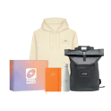
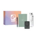
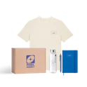


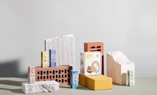


7 Awesome Minimalist Designs Of Packaging

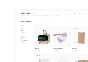
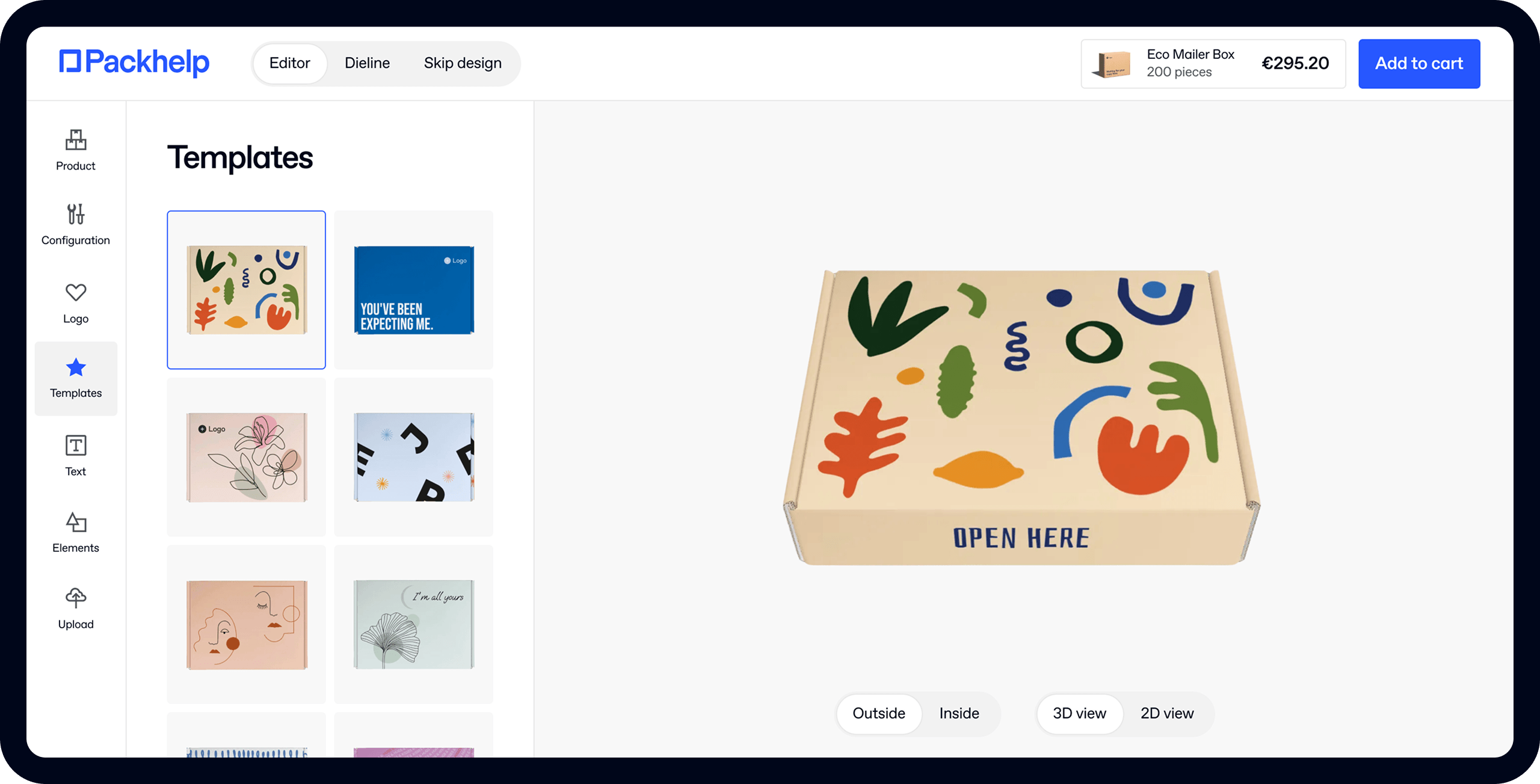
- 200+ templates & patterns
- Real time 3D packaging preview
- Upload logo and choose brand colours
Subscribe now! Receive 15% discount.
Don’t miss out – get 15% off your first order when you join the newsletter. It’s fast, free, and kinda smart.

You're now subscribed!
In this article:
Let’s review some of the best packaging designs, which correspond to the idea of minimalism.
In the today’s world, any kind of excess is perceived as kitschy. If you look at most of the modern brands - their product designs, packaging or even communication strategy - they turn to minimalism. Because, as they say, less is more.
The roots of minimalism
By definition, minimalism is an art movement, most visible in the American culture from the 60s and 70s. It refers to many areas of art and culture - from design to music and architecture.
The very idea of minimalism was to reject the abstract way of thinking, at the same time emphasizing the most elementary and crucial features of a particular thing.
In other words, minimalism strips down the design to its absolute values, bringing it to a state, where nothing can be further removed. Instead of colors bursting like a rainbow, there is the dominance of balance and harmony.
Minimalism is also deeply rooted in numerous cultures and regions in the world. Modern minimalism - mostly in terms of architecture and interior design - is based on the Scandinavian approach. The cold, spacious looks, the use of wood and toned colors - it all comes from Northern Europe. See the photos below to see what we mean.
"(...) Instead of colors bursting like a rainbow, there is the dominance of balance and harmony."

Apart from the Scandinavian influences, minimalism has “watermarks” of the Japanese influences as well. Zen, often associated with balance and calm, has a slightly different meaning in the school of design. In that case, it’s all about simplicity and smart use of space.
Recently, minimalism has gained much significance in the packaging design too.
It doesn’t only apply to a certain kind of brands or industries. Instead, it is a notion, which can be seen in a rising number of companies and projects across many industries.
In order to fully exhibit the minimalism trend in the packaging design, we have picked a few examples to present a special cross-section for you.
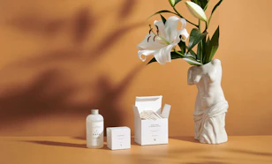
Innocence Paris
One of Packhelp’s clients from France, Innocence, is a tremendous example of minimalism in packaging design. The only imprint is the company’s logo, which focuses the attention of the customer on that particular element. The design is then nuanced by the use of a sticker.
See Packhelp’s offer of cardboard mailer boxes.

Nailsgarden
Nailsgarden is an Argentinian spa studio. Although this is not a particularly “packaging” studio, it surely deserves a place here. The designers, who worked with Nailsgarden on the brand identity, found a common ground for every area - from the interior design through packaging and even... branded coffee cups to comfort the guests. Notice that the colors used here are warm, contrary to many other minimalist designs.
See the full gallery exhibiting the project on Behance.

Jake Busching Wines
Most of us choose wine bottle based on the appeal of the label. There’s no denying that.
The wine producers are well aware of that. Some choose very colorful labels, whilst others follow the trend of minimalism. Jake Busching Wines - a project by Watermark Design agency, - rejected the standard use of copy on the front of the label. Instead, the bottle is intriguing thanks to the distinct blue-ish painting on the label.

Primitive Cyprus
White is often associated with minimalism. It symbolizes purity, goodness and integrity in the psychology of colors. No wonder it is present in so many designs.
Primitive Cyprus, a producer of olive oil, has maximized the impact of white. The olive bottle is entirely white, catching the eye by its snowy shade.

Soylent
A nutritional phenomenon from the U.S., Soylent is also a masterfully designed product packaging. The simple flavor distinction is achieved by the top part of the bottle in color, whilst the rest is black & white.

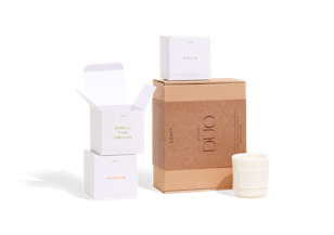
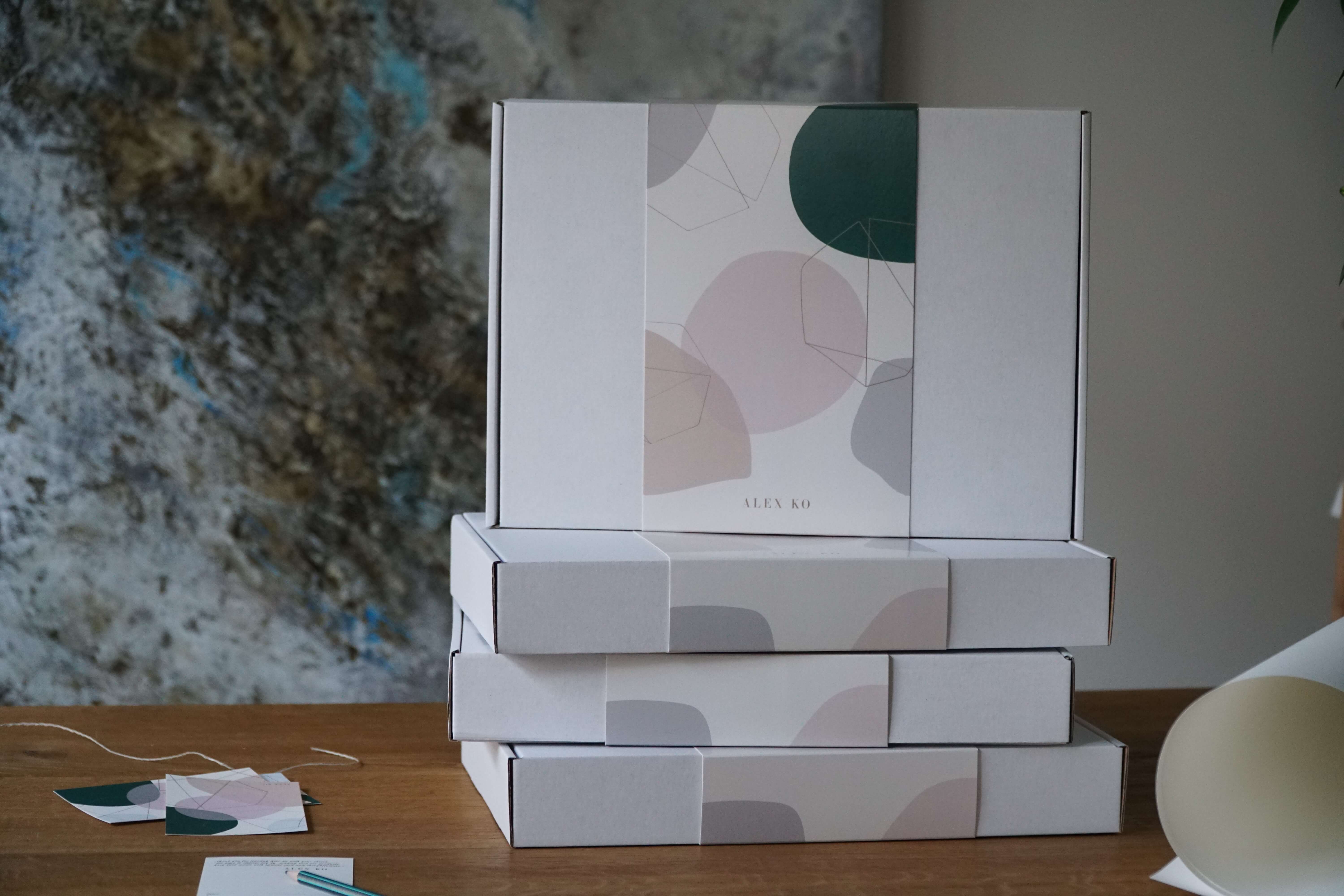
White Willow
Subscription boxes offer a great deal of inspiration.
White Willow, a Canadian lifestyle brand for women, is one of such sources. The plain boxes celebrate a snowy white layer on cardboard, with a black logo at the centre. Additionally, the logo design itself brings elegance and an upscale character to mind.

Ikea
An article about minimalism couldn’t exist without two brands - Apple and Ikea. We decided to be less obvious and used only one of them.
Ikea is the ultimate influence when it comes to minimalism. The Swedish company created a unique visual style across a huge range of their products. A top-notch example is the line of food products. Below is an example of their peanut bags, where the geometric cuts are nothing short of brilliance.

Looking for more inspiration? Follow us on Instagram and join our discussion group on Facebook.


