
































7 Most Common Mistakes Made In The Packaging Design

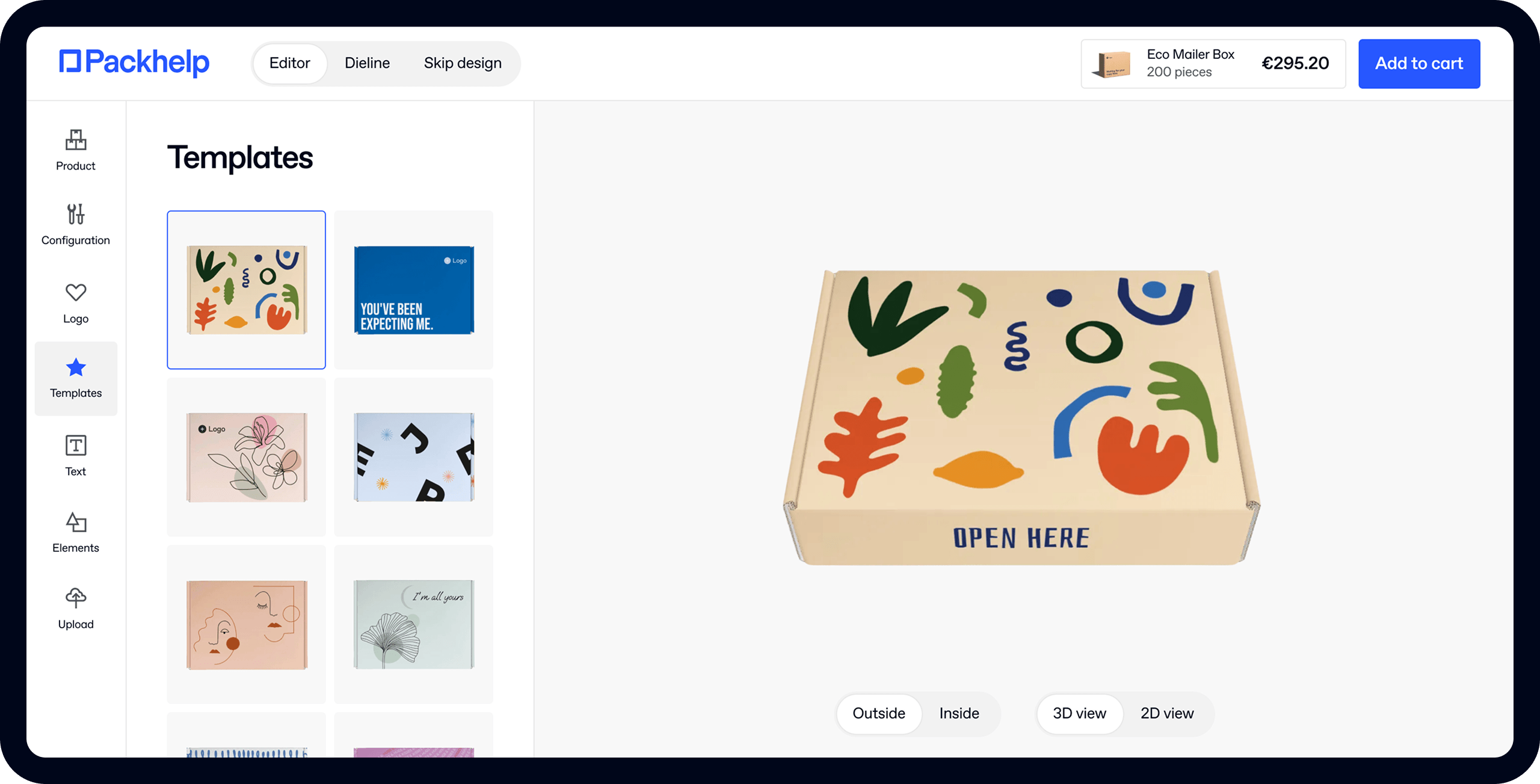
- 200+ templates & patterns
- Real time 3D packaging preview
- Upload logo and choose brand colours

Subscribe now! Receive 15% discount.
Don’t miss out – get 15% off your first order when you join the newsletter. It’s fast, free, and kinda smart.

You're now subscribed!
In this article:
Not everyone is the "heroes of the day" when it comes to the packaging design.
Wrong labeling that misleads customers. Awful designs, which discourage a purchase. Excessive use of plastic. This is straight up bad packaging.
These are some of the most common mistakes made in the designs of packaging. However, there are more examples of designs that are not necessarily a "purchase incentive" for a customer. We have compiled them in this list.
#1 What Is This Product Exactly?
Packaging communicates what the product really is.
It should not be misleading, because most of the customers choose products very quickly. They usually don’t read the labels and are prone to make a purchase based on the look of the packaging.
That is why packaging needs to state clearly. This is a juice, whilst this is a cleaning product. Do you think it's impossible to mix these two? Take a look at the example below.

#2 Wasting Material & Generating Unnecessary Waste
There is more emphasis on the environmental side of doing business nowadays. We covered that in more detail in one of our articles. Customers pay attention to recyclable packaging more than before. Especially big companies are expected to care for the environment.
Here's an example - the food industry is still preparing for changes in thinking about packaging design.
Just like a half of a boiled egg, packed in a non-recyclable plastic tray and wrapped with foil.

#3 So you are eco-friendly or not?
This is a follow-up to the previous mistake. Every effort to be eco-friendly is notable. If you have an eco product, try to emphasize it in your communication. Also via your packaging.
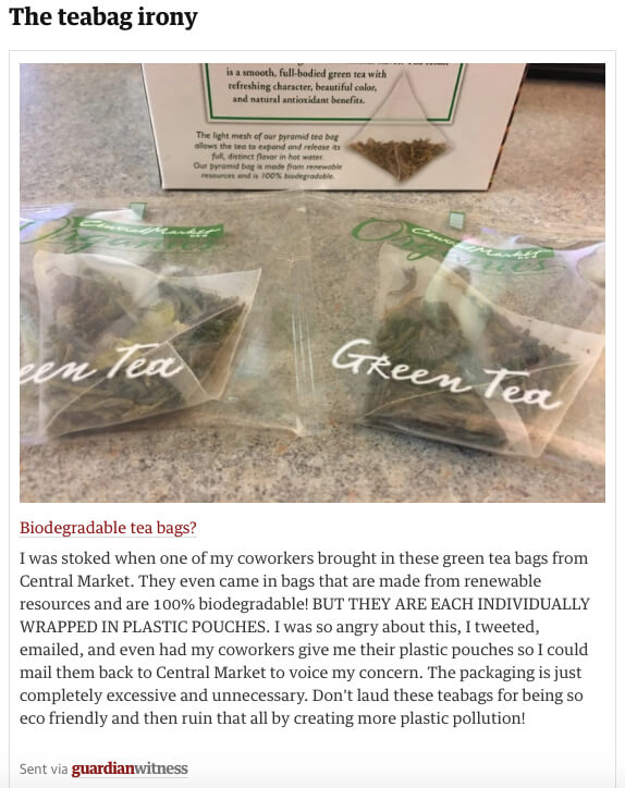
The example of the bio eco tea in recyclable pyramids is an innovation that food markets should seek. However, packing every tea bag in a plastic pouch isn't the best tea packaging design idea.
#4 Wrong Labeling
Wrong labeling is one of the most common mistakes that happen in packaging. Some of the examples can be funny - like those watermelons below that look pretty “corny”.

There are situations though when wrong labeling can pose a threat. This is mainly the case of pharmaceutical products. The information on drugs cannot be misleading, as it may result in serious health damage to the customers.
#5 “I cannot Open This”
This is probably the most common complaint that customers have against packaging.
Even the greatest product will eventually be a let-down if the packaging is impossible to open. If you need scissors to open the packaging of… scissors, then you know something is done wrong.
#6 Packaging Should Be Emotional
The mistake here is the lack of an emotional bond. Every customer likes to have certain feelings towards a brand or a product.
Therefore, the communication via packaging should be emotional. It should trigger some emotions in the customers - make him feel special. The products we buy express who we are - this should be the motto while designing any packaging.
Customers should feel special. This Box Rocks, a subscription box service from the UK, uses a simple yet effective copywriting and an elegant design.

#7 There is too much going on
Minimalism doesn’t suit every brand. In fact, there are brands that make great use of colorful designs.
However, there are also packaging patterns that are simply painful to look at.
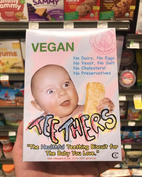
This food product for babies has a box that could easily win a prize for one of the worst designs ever created. There are two types of Comic Sans font used. There’s a weird photo of a scared baby. There’s an entire rainbow of colors used too.
It is frightening to imagine what else could make the cut.