


The Do’s and Don’ts When Designing Tea Packaging

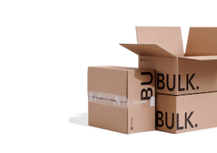
- 200+ templates & patterns
- Real time 3D packaging preview
- Upload logo and choose brand colours
Subscribe now! Receive 15% discount.
Don’t miss out – get 15% off your first order when you join the newsletter. It’s fast, free, and kinda smart.

You're now subscribed!
In this article:
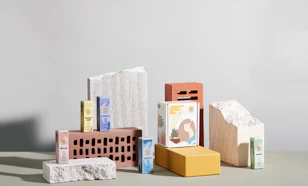
The world of tea packaging design is an engrossing and somewhat intoxicating one to keep track of.
Traditional Victorian-era designs from a bygone era, and solid colours and minimalist elements.
Whether old or new, tea brands, without a doubt, go to all extremes with their packaging design.
Several aspects make your product attractive, including the box you ship it in, the stand-up pouches you package your loose-leaf tea blends in, and even the tea bags themselves.
Each part of the design must work together and build an overall voice for your brand.
Getting started with tea branding
According to Statista, the volume of tea consumed in Europe will rise to 767.9 mkg by 2025, creating growth of around 3.4% annually.
It's clear:
People love their tea.
But they also love trying out new flavours.

Source: Moya Matcha
Tea packaging might be an afterthought for some companies, but it can make yours stand out from any other product on market shelves.
You’re competing with thousands of different items on the store shelves. You have to stand out in your section and amidst a sea of packaging.
You can have the most amazing tea that anyone ever consumed, but if the colours and design of your packaging fall flat, your sales will suffer.
Even the classic tea brand Twinings knows the power of clever packaging design:

This article will discuss the various aspects of a smart tea packaging design and why it works as a marketing tool.
We will also look at some examples of smart packaging.
What Are the Rules of Tea Packaging Design?
Tea packaging keeps the item secure and adds value to the product. It grabs interest and tells a story.
Some of the basic rules of good packaging design include:
- Proper logo placement
- A clear definition of what the product is
- Authenticity and truth
- Differentiation from similar offers
- Securing the tea from moving around too much in shipment
- Showcasing the voice of the brand
Of course, there are other ways tea packaging helps sell your product, but these are basic elements of a good design.
Common tea packaging materials
You'll find some common packaging solutions amongst all tea brands.
Cardboard product boxes, metal tins and even stand up pouches.
The standard product box with some form of kraft paper inside is the go-to packaging solution for many brands that sell their tea in teabags.
Australian brand Yarra Valley Tea Co. is a fine example of tea packaging design on a simple paper stock box.
View this post on Instagram
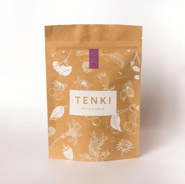
When it comes to loose leaf tea, stand up pouches and doypacks are another common solution. A fine example of this is the Argentinian brand, Tenki Patagonia.
Stand up pouches are durable, cheap, and along with a mailer box, are great for subscription-based brands.
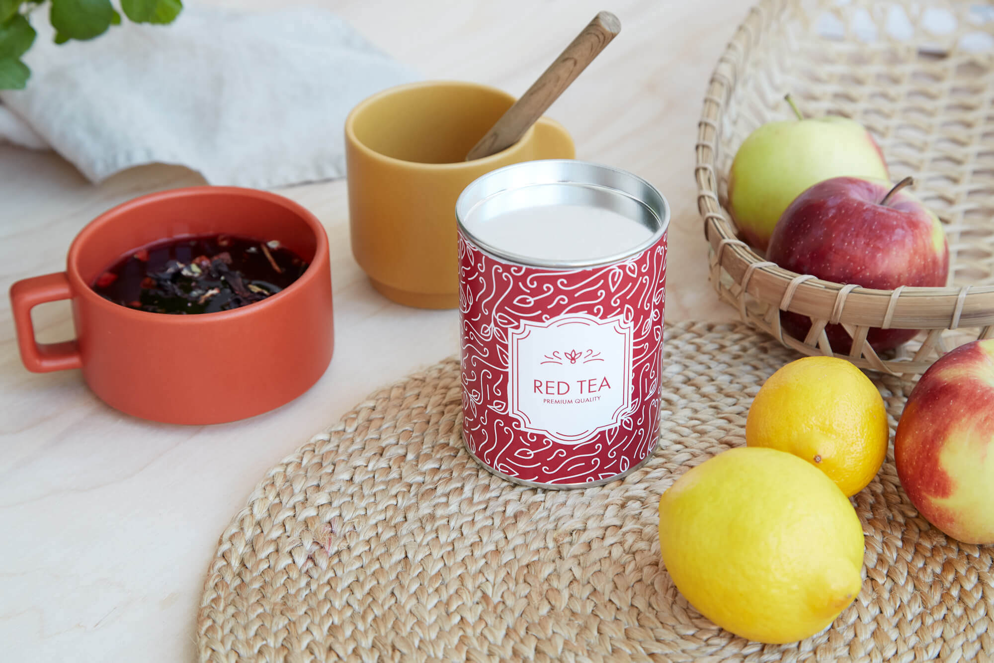
One tea packaging solution that's growing in popularity is the paper can.

Another Polish brand, Dworzysk, use stunningly detailed designs on the side of their tube to create an image that invokes the same feelings that the tea helps drinkers feel.
In this case, it's getting a good night's sleep.
Paper & Tea also use cardboard tubes as the medium for their tea packaging.
View this post on Instagram
But its metal tins that are, without a doubt, one of the most eye-catching forms of tea packaging.
Swedish tea brand Teministeriet sells their range of teas in black metal tins.

The solid black design allows the simple white text to draw in the eyes of the view to read the type of tea - in the case, the '150' tea.
Metal tins are strong and robust, making them one of the best examples of packaging sustainability in tea packaging design.
These tins are frequently reused elsewhere in a household and are entirely recyclable when they are disposed of.
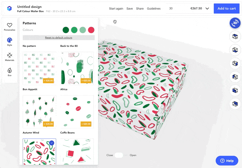
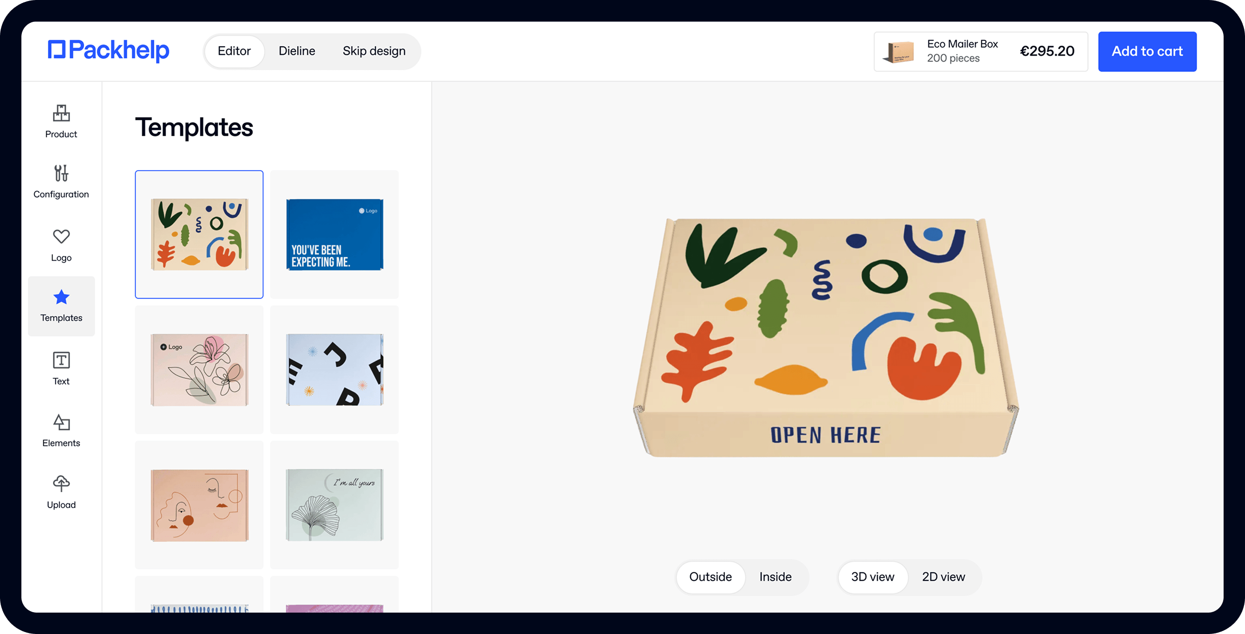
See how to use Packhelp's online designer to create custom tea packaging
Let’s dig into how you accomplish these features and look at some examples of brands doing an excellent job with their tea packaging.
Do: Customise the Design
Know who your target audience is and what makes them tick.
Which pain points drive them to try a new tea brand?
Perhaps they want something different in their lives.
Maybe they care most about flavour.
The only way of figuring out your customers’ needs is by surveying them and digging deep into the psychographics of your buyer personas.
Once you understand the forces driving them to seek out a new tea, you’ll know how to package it to meet their needs.
Tea company Harney & Sons place some of their speciality tea sachets in tin cans.

The design gives a hint of times gone by and is the perfect choice for those feeling a bit nostalgic.
This Victorian-era feel implies that the brand has been around for a long time.
Consumer intuition says that if a brand has been around for a long time, it's trustworthy.
Therefore, this tea must be good, because it's been around for so long.
Don’t: Go Cheap
The cost of tea packaging can eat into your profit margins. After all, a tin can costs more to produce than a cardboard box.
However, if you want your item to compete against luxury goods, you must spend a bit more on your design and materials.
You don’t have to use tin but think through even the thickness of the cardboard or how the colours look on the packaging’s background.

Building trust amongst your consumers is vital.
A brand that's consistent in its branding is one that's trustworthy: it shows pride in one's name and product.
What makes your company stand out from other tea entrepreneurs? How can you showcase your unique value proposition on the box?

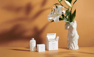
Do: Embrace a Cause
What do you care most about as a brand? How can you highlight this through your tea packaging?
For example, if you care about feeding hungry children, you might include a note stating each box purchased helps a specific cause.
Your tea packaging design should also echo what your company cares about: its values.
If your business is one that prioritises conservation and sustainability, this should be echoed in your tea's ingredients.

Juniper Ridge embraces nature both via the design and the tea packaging material.
The design shows plants and a lot of white space.
The designer layered three strips resembling parchment paper to contain text.
The box itself is Sustainable Forestry Initiative (SFI) material. Even the ink is environmentally friendly.
The wording on the package shows their commitment to being eco-friendly.
It points out the packing materials and shares that they cultivate the ingredients in the tea responsibly to not harm the environment.
Don’t: Forget Your Brand Identity.
Since 90% of people admit to remembering a company based on colours and images, your packaging should include your logo and colour palette.
If people already associate red with your tea, don’t deviate too much from that.
Your logo is also a big part of who you are as a brand.
Make sure it takes a prominent place on your packaging. Ideally, people associate your voice with your tea.
When they want a different flavour or type, they’ll look for your symbols and recognise you immediately.
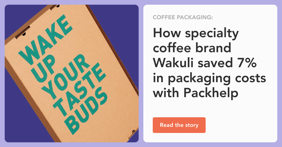
Below is a fine example of using colour to differentiate flavours from Raven Coffee:

Learn the finer details about coffee packaging here
At the same time, think about the image you project in the words you use and the tone you take.
If you want to be seen as a young, hip business, tap into language familiar to the younger generation.
If you wish to reach senior citizens, utilise a classic style and tone.
Pukka Herbs do this with all their tea packaging. However, it's interesting to see how those values are recreated on their large setup boxes used as gift sets.

The same floral motifs associated with their logo and other packaging solutions are echoed on the larger boxes.
This is a fine example of consistent tea packaging branding over multiple mediums while using colour to differentiate flavours.
Do: Focus on the Basics
While you want your tea packaging to stand out, don’t be afraid to scale things back to a more minimalist style.
Let your product speak for itself. The quality of the box and the items inside can do a lot of your talking for you.
A minimalist look might not be suitable for all tea packaging, but if you already have a fairly established brand, it can focus on what’s inside.
There are still some things you’ll need to include, such as ingredients, your tagline, and logo.
However, you don’t need to add vivid colour or tons of graphics to get your point across.
Is the look right for you? Only you can decide the voice of your tea brand.

Smith Tea keeps its package design simple.
They use neutral black and white with a touch of gold. Note the high-quality cardboard with a glossy finish and hot stamping.
The number of elements on the container is minimal.
To match the style of their tea boxes, they also keep their site to only a couple of colours and add plenty of white space around images and text.
The overall impression is one of simplicity and quality.
TWG Tea is another example of minimalistic packaging design.

In this example, you can see how they use black and gold to imply excellence and quality.
Do: Tell a Story
People love a good brand story.
- How did you get where you are today?
- What motivated you to start your company?
- Have you overcome any major hurdles?
You might think that’s a lot to convey on your packaging, but you can easily tell a story with clever copy.
Condense your primary victory into a single line of five or fewer words.
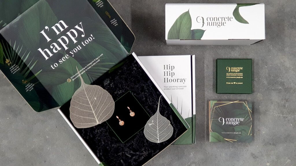
Learn more about Concrete Jungle and how they communicate their uniqueness.
Include it as a tagline on your product packaging.
You can even add QR codes and links that take the user to a more in-depth look at your company’s timeline.
Don’t: Overload Your Design.
We’ve already talked about utilising a minimalist design for your tea packaging.
There is a lot of information you’d like to convey to your users, but it’s important to focus only on the essential elements.
Otherwise, your design becomes overloaded with competing elements.

Too much noise and a busy look may turn customers away.
When given a choice between two designs, which one is best?
You’ll find it is almost always the one with less information or condensed wording.
Pictures say more than words, so think about whether you can convey the same message with a photo or illustration.
Study Your Competition
Creating the perfect tea packaging requires creativity, knowledge, and attention to detail.
Take time to study your competition and what their boxes look like. Is yours different enough to grab attention while still making it clear tea is inside?
Know your customer base well, as they may have different preferences than other tea brands.
Once you tap into your users’ preferences and develop the perfect design, you should run it past a control group or two.
Get feedback on any tweaks that might improve it further.
Take the time on the front end to develop the best product packaging possible.
The result will be excellent sales and brand recognition.


