


10 Examples of the Best Craft Beer Packaging and Branding

- 200+ templates & patterns
- Real time 3D packaging preview
- Upload logo and choose brand colours
Subscribe now! Receive 15% discount.
Don’t miss out – get 15% off your first order when you join the newsletter. It’s fast, free, and kinda smart.

You're now subscribed!
In this article:
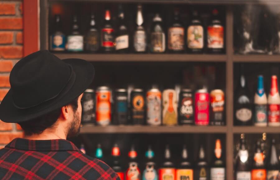
With the rise of craft beer since in the 2000s, companies that sell beer, liquor, and wine have found it harder than ever to stand out in a crowded market.
If you’ve been to a liquor store recently, you would understand. Aisle after aisle of craft beer and wine from around the country. How does one stand out?
That trend isn’t slowing down, as the number of breweries in the US is at an all-time high at more than 7,500.
Brewmasters continue to open new breweries, with over 1,000 new craft breweries opening their doors since the end of 2017.
For many craft breweries, it’s through branding its beer and brewery logo design. From classic logo designs to flashy neon branding, brands are getting creative with their logos.
Many brands are experimenting with different materials and unconventional shapes to help capture the eye of the consumer outside of a logo, such as custom winery boxes and odd bottle design.
You can event buy vodka in the shape of an alien head.

These brands are at the forefront of innovative alcohol branding and that new craft brands can still enter a crowded market and be successful.
10 Best Beer Branding Examples
With that in mind, here are 10 of the best craft beer branding examples in 2019 for your brand to use as inspiration to create a brand experience for your:
- brewpub
- cidery
- winery
- distillery
- just about any other building where people consume your drink.
1. Left Field Brewing
The Toronto brewing company, Left Field Brewing went through a redesign a few years back, and with it came a beautiful new can design across their beer offerings.

The new branding included bright colours, minimalistic designs iconic city locations on the can, clean lines, and a template.
All this can be used across all of their beer types to create an experience instantly recognizable no matter which can a customer was drinking.
The brand breaks up its designs with simple lines, both vertically and horizontally.
It also includes block colour patterns, not allowing multiple colours to blend in each design, even in its taproom.

A nice touch is also keeping the baseball theme.
The brand has been attached to baseball and used themes around the sport in the branding since inception - so being able to keep the baseball vibes is a nice callback to the brand’s roots.
2. Revolution Brewing
Revolution Brewing is a Chicago-based brewer and has succeeded in its market by going all-in on it’s “revolution” theme.

Its branding is heavy on military themes, down to the in your face font type.
They put a nice twist on the military branding by having people on its packaging appearing to be a hybrid between a human and hops.
Kinda cool, but kinda creepy, and a lot of steampunk vibes.
Revolution has also built essentially a template for its can design, with two colour variations leading with horizontal lines into the core-graphic concept on each can.
This allows Revolution Brewing to launch new beer types while keeping its recognizable design concept.

Another fun subtle throwback in its branding is the use of Chicago’s trademark stars found in the city’s flag.
But Revolution’s most iconic branding choice?
The tap handle at bars and breweries.

Anywhere that serves Revolution beer on tap are sent the brand’s iconic fist handle.
It’s a callback to the revolution theme, as the fist is visible grasping hops in the brand’s logo.
It is also instantly recognizable from a distance at any bar, giving those familiar with Revolution Brewing a familiar option to order at a bar.
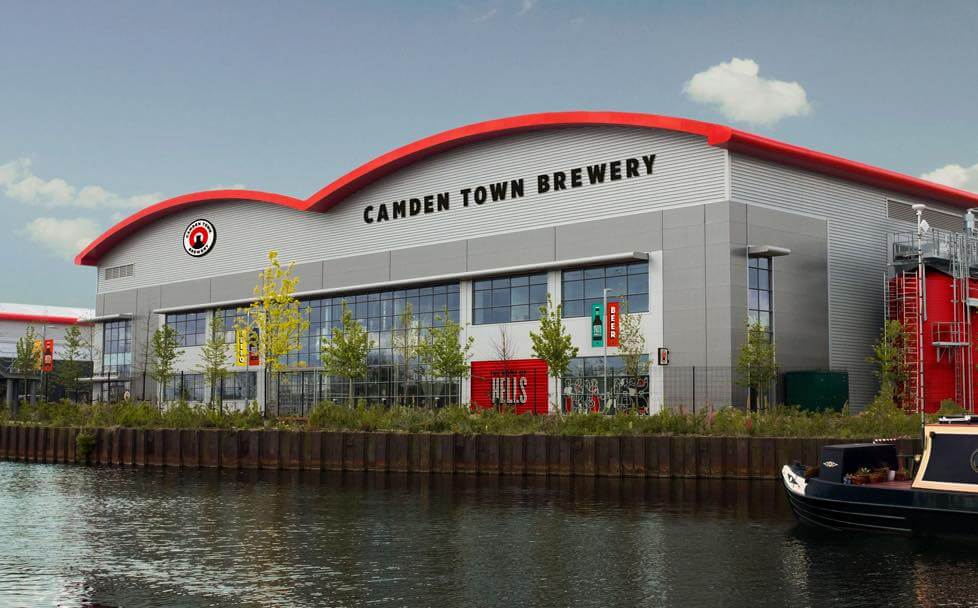
3. Camden Town Brewery
A London-based brewery, Camden Town Brewery is a branding concept similar to Left Field Brewing.
The company created a template that colours and names can be exchanged out for new beer launches, but it still remains quickly ID’d by those familiar with Camden’s brand.

The bright colour palette and unique font face give the brand a memorable experience that stands out in beer fans’ minds.
It also makes the company stick out on a crowded beer shelf against lineups with duller designs.
For the majority of Camden’s branding, they stick with its traditional red, black, and white logo and colour palette.
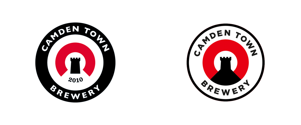
Having a simple and clean concept allows the brand to play with these core colours across its cans, logos, bottles, and even the design of its taprooms.
4. Talas
Talas is a Norway brewery that is one of the most unique packaging experiences of anyone on this list.
It beer comes in a paper bags.
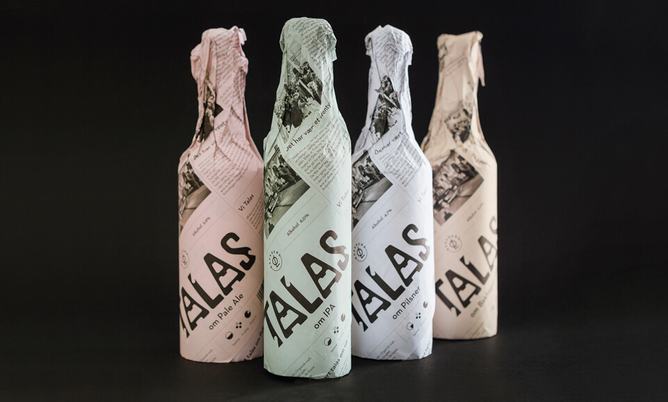
The brand manages to have given a unique drinking experience to its customers, but tie the theme back to traditional drinking themes, while staying trendy.
Who knew drinking out of a paper bag could be classy?
The brand kills it because not only is it unique packaging design, but it’s sleek, clean, and templatized.
Talas can launch new lines of beer and continue to use the layout with small colour tone tweaks.
My favourite element of Tala’s branding is its unique font typeface.

It’s a completely custom font face that incorporates beer-bottle openers into letter design.
It is subtle enough that unless someone points it out, you may not even notice.
Not only does it allow for the brand to incorporate brewery-related themes into the concept, but it’s unique enough to stand out in a crowd on its own in an almost hieroglyphic way.
5. Halo Brewery
Halo Brewery is a Toronto brewery that uses adventurous designs in its branding to match its experimental use of hops and ingredients in its beer lineup.

Its use of geometric shapes and vibrant colours gives it an 80s meets present-day feel.
It doesn’t have a problem sticking out in a liquor store and attracts drinkers looking for a modern yet unconventional craft beer.
The brand utilizes bright colours and odd shapes in branding outside of its cans as well.
Its taproom has a vibrant set of circle logos outside its entrance that is both eclectic and inviting.

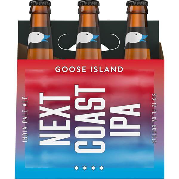
6. Goose Island Next Coast IPA
Goose Island is a Chicago-based brewery, and for the majority of its products and beer lines stick to a traditional branding experience that works well for the company.
However last Summer, Goose Island launched its new Next Coast IPA, with cotton candy colours, and a chrome can.
Even the label feels as if it’s made with a different material than any beer can I’ve held before.

Its branding is new and flashy, a new direction for the more traditional Goose Island brand.
It takes themes and concepts from recent brand redesigns in the SaaS industry, including Asana and fellow Chicago company G2.
Goose Island is also sticking with the cotton-candy theme everywhere Next Coast IPA is spotted - from the can, bottle, logo, packaging, website.
It’s all themed exactly the same. Consistency is key in branding any product, especially new product launches.
7. Pipeworks Brewing Co
Pipeworks is yet another Chicago-brewery company that is the most aggressive brand and packaging concepts on this list.

It goes the route of radical, psychedelic themes, blending a neon-bright colour-scheme with mythical creatures (unicorns, dragons, mermaids) and a funky, graffiti-style font face.
The brewery is located between the Hermosa, Logan Square, and Humboldt Park neighbourhoods, and draws inspiration from the local communities and artists in its concepts - helping tie the brand back to its roots.

For those in the beer alley looking for to base their purchasing decision on branding and can packaging design, Pipeworks takes the cake for sticking out in a line of bottles.
Key Design Elements for Branding Your Craft Beer and Brewery
There is more to building a brand than designing a logo. The most subtle of brand elements can change the entire tone of the experience. Take a moment to step back and build out a brewery business plan that includes your brand’s tone and designs.
A few tips to keep in mind when designing your beer’s brand include:
Typography
From serif, sans-serif, and script font face types, there are hundreds of different typography families, with each family have potentially dozens of subsets of just its typeface.
After selecting a specific typography, create rules around using stylizations of that font family, including line-height and spacing, boldness, and other decorative typography options.
Colour Palette
Early on in your brand’s inception, settle on a colour palette. One colour will be your brand’s main CTA colour.
Create rules around how and when to use each specific colour to maintain consistency.
Lines and Shapes
Elements outside of text such as lines and shapes help break up designs.
They also become intrinsically attached to brands, as companies can use the same lines and shapes throughout its branding with slight alterationsallowing brands that do this well to become recognizable from only its subtle elements. This helps reinforce ideas within customer bases through design - as shapes with sharp and soft edges convey very different feelings. Certain shapes can be subtle inclusions or be prominent in the design. If your brand has a strong history or fun backstory, incorporate shapes from the company’s history into the design - acting as a callback to the company’s roots.
Spacing
Thanks to Apple, white space is one of the most crucial design keys. Playing with white space allows designs to be breathable and become airy. Too little white space and designs become cluttered and messy, making it unclear what is supposed to be the main eye-catching element.
Main Takeaways - Create an Unforgettable Brand Experience
It’s not impossible to launch a new craft beer or alcohol line in 2019 and have it stick in the marketplace - but brewmasters need to pay attention to their brand’s experience to stand out in a crowded marketplace.
The brands on this list mixed elements of their location, brand name, overall beer history, and more to create experiences ranging from exotic to retro. The direction you can take with your brand is limitless, but be sure to reign it in to meet overarching themes related to your company.


