


Custom Shapes – Do People Notice Details In Packaging?

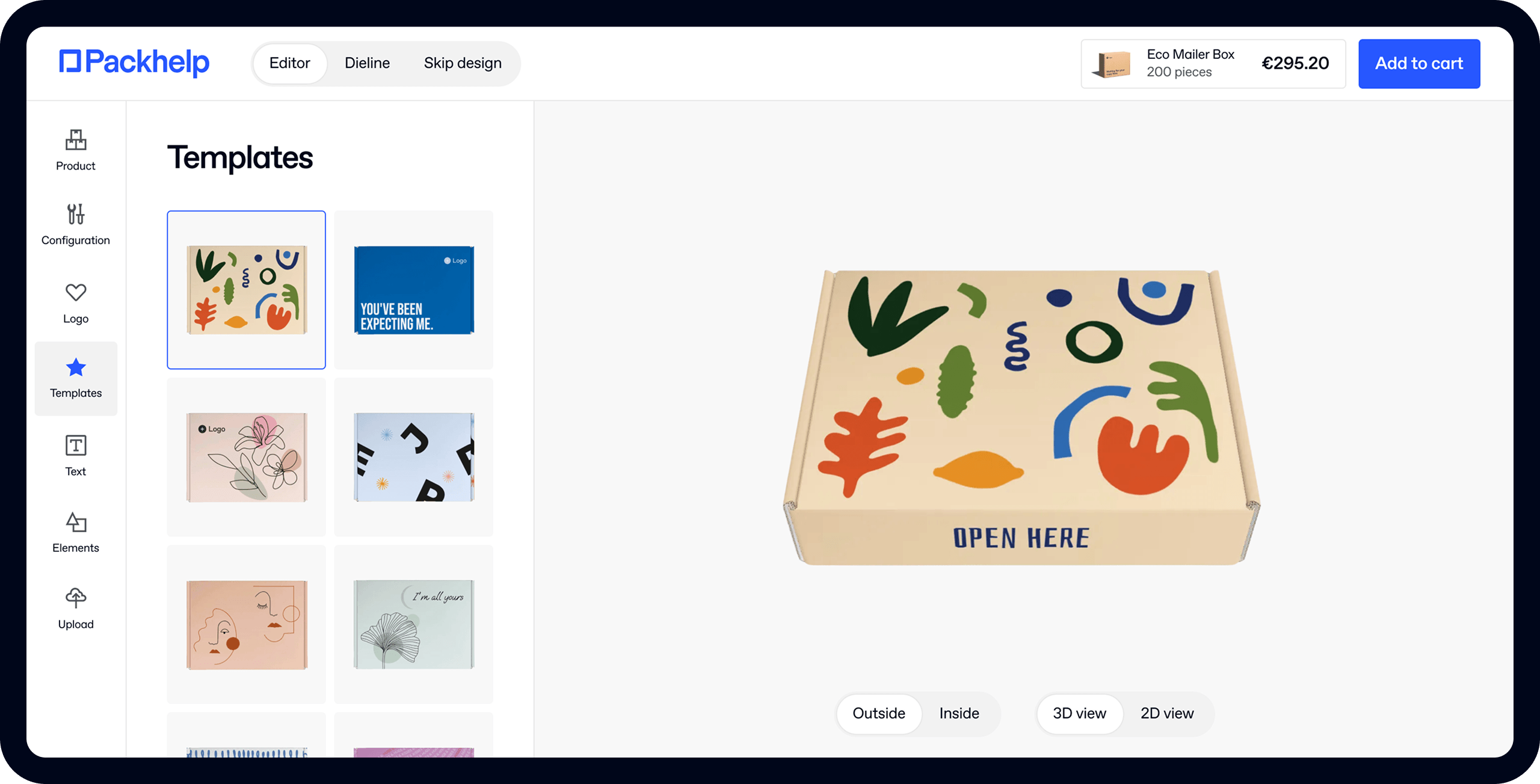
- 200+ templates & patterns
- Real time 3D packaging preview
- Upload logo and choose brand colours
Subscribe now! Receive 15% discount.
Don’t miss out – get 15% off your first order when you join the newsletter. It’s fast, free, and kinda smart.

You're now subscribed!
In this article:
When should you invest in a unique shape of your custom packaging?
Geometrical shapes, unusual silhouettes, embossed surfaces - they are all used to add a novelty to the packaging design. Designing new packaging can be both time-consuming and costly, so it's better to know the ins and outs.
Simplicity vs. Creativity
The general concept of simplicity versus creativity is a clash of two worlds colliding. While some designers prefer minimalism, others feel that packaging should be a brand's show-off. Both sides have their views, which means one thing - there isn't a single, golden recipe for the packaging design.
In spite of that, we see that some designs work and some do not. Frankly, most of them fail - according to one of the research concerning customer satisfaction, only 11% of packaging designs satisfy clients entirely. This leaves lots of space for improvement.
Which custom shapes do the trick?
The most common (and probably least liked) answer applies here - it depends. We mean it because it would be best to analyze such issues per case. Therefore, we looked at some examples and examined them - did the custom shape work out in each of these cases?
The first is a project of a honey bottle, designed by Tamara Mihajlović for BeeLoved. The initial impression is - we are smitten. The creative metaphor of honeycombs weaved into the shape is a fantastic idea. It also emphasizes the brand's upscale character.
However, once you think from the customer's perspective, this design loses its glow. The issue with BeeLoved packaging solution is that it's highly impractical. There are so many skews and cants in the silhouette of this bottle that it would be a nightmare to eat every drop of honey.

A different case is a packaging design, which guarantees a fantastic product exposure. YOPE, a Packhelp's client, has recently shared images of their new packaging line, manufactured by our company. This custom shape is not too fanciful; it balances practical approach with branding and creativity. Moreover, it matches the product design itself.
View the full gallery in YOPE's inspiration profile.

Gloji has also devised a fantastic innovation. The producer of 100% natural juices took quite literally the idea behind its slogan "the juice that makes you glow." Their packaging is a bottle shaped like a... lightbulb. It includes a minimalist label and a whole lot of original customer experience. In comparison with the example of BeeLoved mentioned above, Gloji's idea is also practical.

Sometimes, the creativity of the packaging designers can cause a headache in the logistics department. It's precisely the case of "teabag hangers", a bold project you can see below. The very idea of viewing a tea box as a wardrobe is mind-blowing. Each teabag is "a piece of clothing", which makes this design cute. Still, it's a nightmare from the logistics point of view - even if we would love to have one of these in our office.

Although the shape generally remained the same, Coca-Cola has tried dozens of their bottle designs. It's a good lesson concerning market research. Even if you are not a leader in your market, change your packaging step by step. If you want to make a cut in your box, add partitions inside and tie it up with a colorful ribbon, be sure that it will be a shock to your customers.

What would be the lessons learned? The most creative projects are often impractical. They are the fantasies of the designers, but they tend to forget about the reality of the market. Seek for the simple solutions - be smart about your packaging.
What are the dangers of overdoing?
Have you ever heard of the so-called wrap rage? It's crucial to learn about it - especially if you think about going a bit crazy with your packaging design.
Wrap rage, as the name suggests, refers to a situation, when packaging makes the customer angry.
Excessive layers or a ridiculous shape might cause it (although the most common reason is when we are unable to open it). Either way, this is something you want to avoid at all costs.
Another danger is much more severe to you from a business point of view. Changes in the packaging design can be both costly and ineffective. Even if it is a part of a broad rebranding process, think twice about the changes. Customers tend to pay attention to details. When you have a certain reputation, it might be risky to play with it.
Summing Up - What Are The Dos and Dont's?
After reviewing several cases and understanding the dangers, we can name some simple rules to follow.
- Creative, but also practical. Avoid exchanging creativity with a practical approach. A simple, minimalist cardboard box leaves a lot of space for tiny nuances - you can add a ribbon, play with the imprint style, etc. Being creative is essential, but it shouldn't be your primary objective.
- Customers do not like packaging that they can't open. Nobody likes wasting time, right?
- Do research. As in every other area of business, do your homework. You can add the new features to your packaging step by step, make it a long-term project. Test the reaction to each change, see the market.
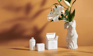
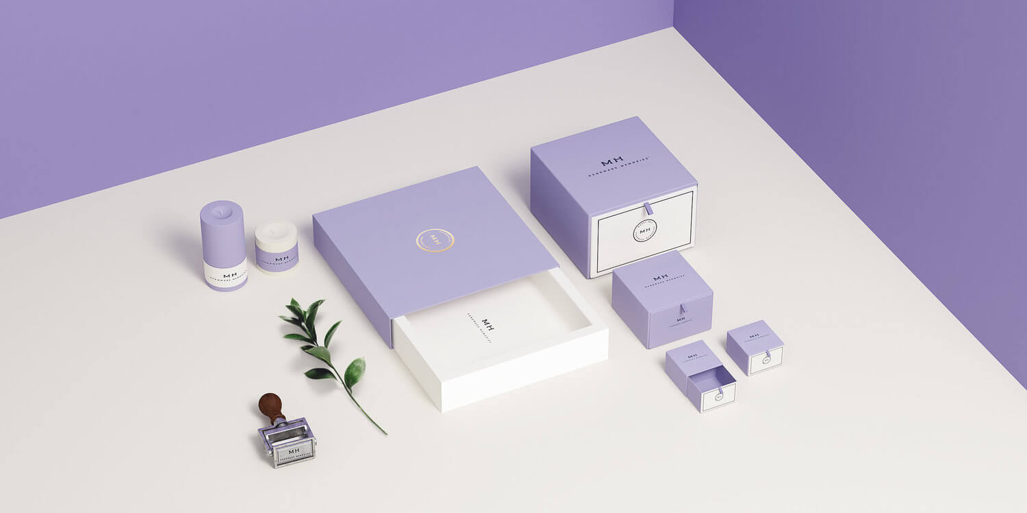
The header presents packaging of MH Handmade Memories.


