Packaging Design: The Forgotten Marketing Medium

- 200+ templates & patterns
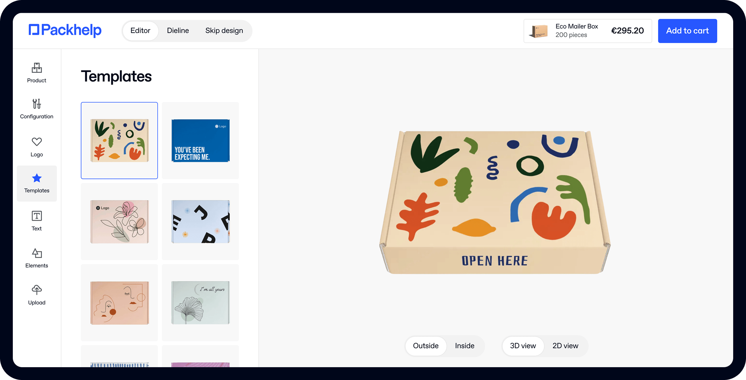
- Real time 3D packaging preview
- Upload logo and choose brand colours
Subscribe now! Receive 15% discount.
Don’t miss out – get 15% off your first order when you join the newsletter. It’s fast, free, and kinda smart.
You're now subscribed!
In this article:
Consider for a moment, the packaging design of a ring box.
This traditional form of packaging creates the stage that presents the glorious product to the (hopeful) bride-to-be.
The design of the product box is simple - understated and inconspicuous.
But the packaging is also elegant, opulent and pleasing to the eye.
This is a perfect example of design and the medium of packaging working together to create an experience that enhances the product.

Packaging of the world is vast, dynamic and a very very creative medium. They can be simple mailing boxes, it can be a polymailers, mailer bag or it can be a tube box, just like you see above.
Product boxes fulfil many roles like identification, protection, marketing and transportation. So with these many roles to fill, you can see how quickly and easily the topic gets complicated.
In this article, you'll take a deep dive into the relationship between physical packaging and package design.
You'll also see:
- What is packaging design?
- How to pick the best packaging for your product
- How to design packaging for your brand
- Package box design inspiration
Let's clear up the definition, first.
What is packaging design?
Packaging design is the process of designing product packaging to securely contain, identify and deliver a product.
Whether it’s food boxes from McDonald’s, Apple's iPhone packaging, the box that your new fridge comes in, or even tea bags, just about every product in a store has packaging.
Most of it is good, some of it bad.
Graphic designers, packaging engineers or just about anyone can design packaging, regardless of their skills or expertise.
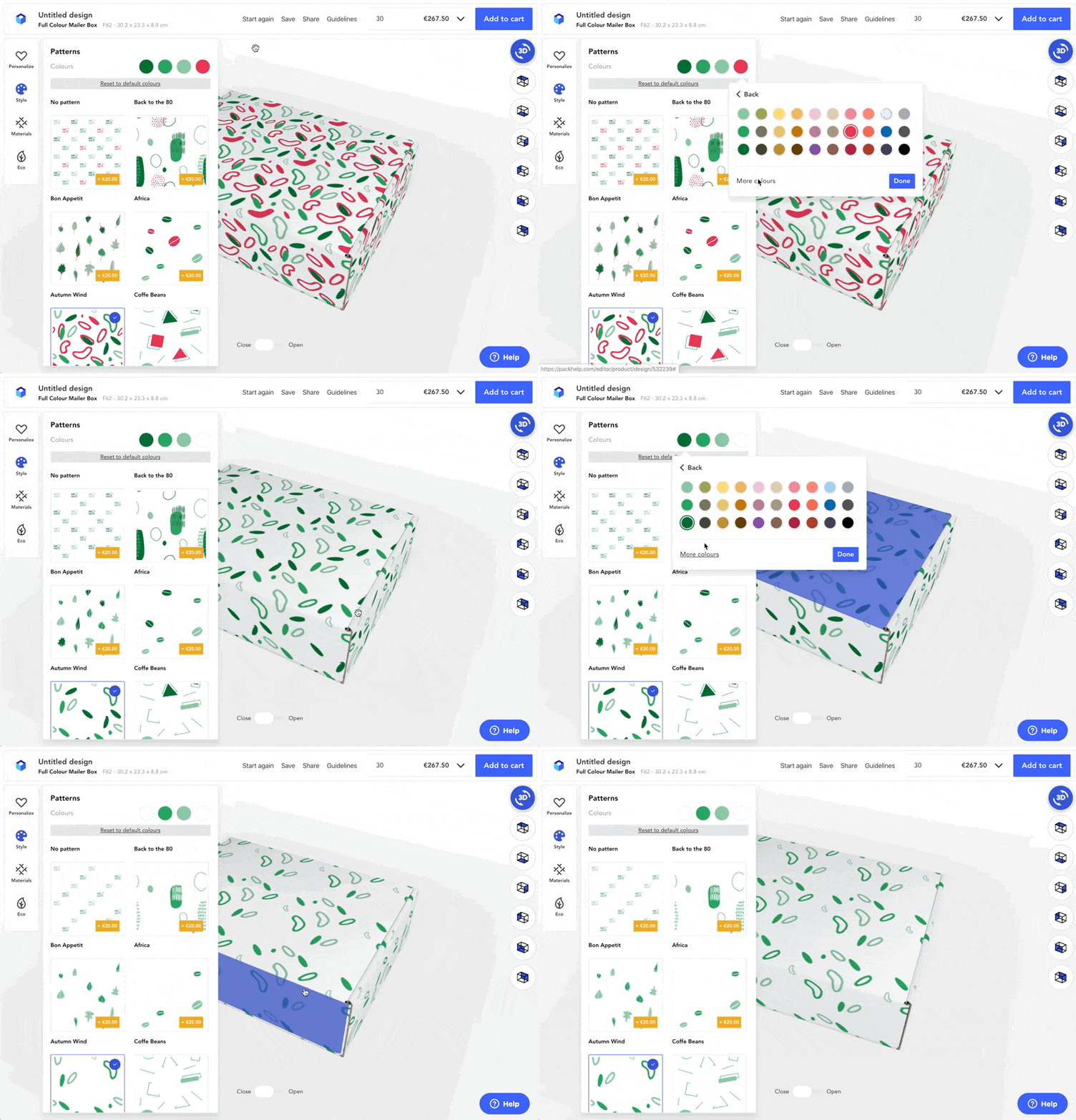
Click here to see how to use Packhelp's online designer to design your packaging online
Designing packaging for goods and products
Designing packaging for products is a little more complicated than slapping a sticker on a cardboard box. First of all, you need to identify the packaging medium.
Will it be a simple custom printed cardboard box, or will it be a high-end rigid box?
The medium of your packaging is very often overlooked.
Once you've decided on a material, consider the following:
- Graphic design and packaging
- Physical packaging design
- Marketing and design
Each one of these defines design in a different way.
Understanding these various points of views will also help you find the best packaging for the products you're selling.
Graphic design and packaging
From a graphic designer’s point of view, design is how the brand's design is reflected in the product boxes.
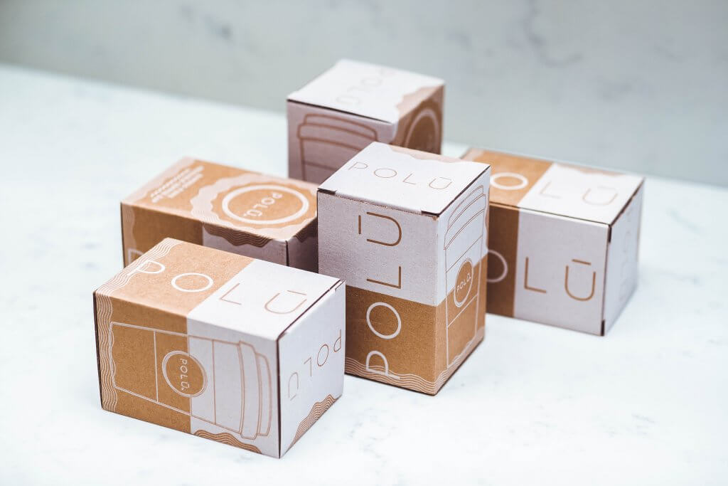
Click here to see more about Polu Cups
In this sense, the design concept needs to attract the attention of a customer, but also provide information about the product.
Packaging graphics should also take the brand's design and motives and show it off on the box. Considering hiring a professional graphic designer or using a simple yet effective online graphic maker to simplify the process.
Take a look at some of our design tips below:
Physical packaging
The second part to consider is the physical design limitations of your product package.
Sure, you can have a box that plays the “Titanic” theme when opened, but not at the expense of product security.
No matter how 'out there' your custom packaging may be, it needs to serve a purpose - and that is keeping your product secure.
Manufacturing limitations also need to be taken into consideration.
Sure, you can design a safe and secure die cut box that plays 'My Heart Will Go On' every time it's opened, but can someone actually make that?
Below is an example from Intel of packaging that's probably a little too extravagant:

The best place to get an idea of what's actually achievable is to look at your competitors.
Look at the shapes, materials and other aspects of the design of their packaging, and consider working within those boundaries, as you know they work for your competitor!
Use the standard packaging solutions of your industry as a foundation, and innovate from there. For example, if you're selling fitness supplements, consider classic jars and bottles first before venturing into the world of designer shapes and custom solutions.
Other things to consider:
- A printer's available printing types
- The best packaging materials for your needs
- Durability & weight of your final packaging
- Add-ons, like embossing, hot stamping, UV finish etc

See how BWM Poland used cardboard drawer boxes to deliver keys to test drive a new model to motoring journalists.
You can have the most extravagant design ideas out there, but if your packaging bundles can't actually be manufactured, it'll stay an idea.
Marketing and design
The third topic in the discussion is marketing.
Using your packaging as a form of marketing, sometimes called 'Packvertising' is a crucial, and often overlooked part of the box design.
In a well-thought definition, provided by O’Reilly, you find that:
“Packaging design is the connection of form, structure, materials, colour, imagery, typography, and regulatory information with ancillary design elements to make a product suitable for marketing.”
To put that into a simpler form:
Your packaging is an element of your marketing strategy.
It needs to:
- Appeal to a well-defined buyer persona
- Promote your product's unique selling point
- Communicate your brand's identity
Below is an example of how Coco & Eve and their branding agency use their packaging to remind the customer that they've made the right choice.

Click here to see more about Coco and Eve and how they use their packaging as a marketing channel
Simon Preece from Forbes says:
“Consumers act when a brand makes them feel something. When someone looks at you, you’re compelled to look back to determine the nature of the attraction. That’s your survival instinct at work.”
Evoking emotions is key.
Packaging is the most natural medium to make customers care about a product they haven't yet bought.
A unique shape, pattern or colour can set your brand apart from the competition it's sitting right next to on the shelf.
After you've caught the customer's attention, the smaller elements take over.
Copy, imagery and communication that built that rapport and trust between product and customer.
But before you start designing your packaging...
Your packaging represents your entire brand.
It informs the buyer about the product but also associates the product as being part of your brand.
So your product and brand needed to be tied together on your packaging.
Many brands get this wrong, especially those in newborn industries like the legal cannabis industry and its branding. Luckily, there's already standard CBD packaging on hand.
Make sure you've got the following on hand as you design your product boxes:
Brand logo
If this is your first venture into designing packaging for products, then the central piece of your product package design will more than likely be your logo.
It may be a simple black logo on kraft cardboard, as you can see below:

Click here to see more about Slopes & Town and their minimalist box design
Alternatively, you might opt for an intricate design that covers all internal and external surfaces, like this:
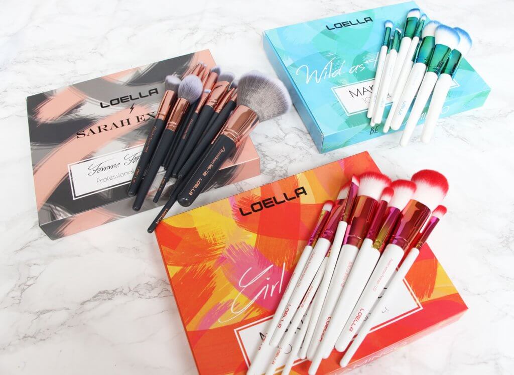
See more about Loella and how they use their box design as a branding channel
Either way, have your logo on hand and use it in your box design process.
Make sure you use a high-quality vector file to avoid pixelation!
Colours
Along with your logo, you've probably got a handful of colours that your brand associates with.
Echoing these colours onto your packaging is a great way to quickly convey your brand's presence.

Click here to see more about Alex Ko's fashion label and their branding
Above, you can see how Alex Ko uses a sleeved mailer box and a plain shipping boxes to create a minimalist feel, but still deliver the impression of their branding.
Using one colour palette in your store, on your product, on your website and on your packaging is a core element in branding consistency.
Fonts
Fonts are tricky, as a brand's logo may be nothing more than its name in a specific font - GMC, for example.
But you may want to use a specific font to list your products' USPs on your product packaging.
In that case, know exactly what they are, the ideal weights for them as well as letter spacing.

Make sure your font also has the native characters you need. For example, ę, ¿, ß, æ and so on.
Other Imagery
Is there a specific logo used for products that are made in your country?

Logos that represent industry standards?

Click here to learn more about the FSC Certified Wood Pulp used to make Packhelp Products
These little elements are often overlooked but really bring your entire design together.
Packaging materials and design
Next up you'll see the most common types of packaging materials used in packaging products.
Corrugated cardboard
Cardboard is one of the most popular and sustainable packaging materials. Typical cardboard fibre is made up of at least 90% recycled material and is common in both ecommerce and retail.
It's great for products and industries like:
But what does the corrugated part of corrugated cardboard mean?
Corrugated cardboard means that the sheets of cardboard are joined together to create layers called a flute. These layers provide cushioning and strengthen the box.
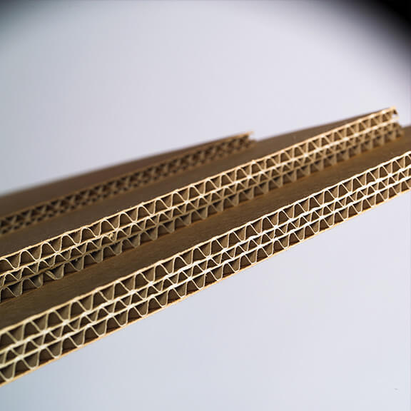
Corrugated cardboard is the perfect blend of minimal weight and maximum strength.
This makes cardboard the go-to packaging solution for heavy items like shoes, but also for many ecommerce companies, as it can handle most impacts.
Corrugated cardboard is also the perfect blank canvas for designing your packaging.
The natural kraft texture can be printed directly, or a white canvas can be the foundation for any type of colour you need.
Biodegradable & compostable packaging materials
Plant-based materials are also used as the basis of many packaging solutions.
Usually, these materials are just as printable and durable as cardboard but are also completely biodegradable, if not compostable.
Organic materials are also used in the production of packaging. This refers mostly to plant-based ingredients, which is a rising trend in the packaging industry.
Bruzel, a Belgian Waffle brand, sell their waffles in edible packaging that you can see below:

While edible packaging might be a bit too ambitious for many brands, packaging that does no harm to the environment is certainly a step in the right direction.
With many parts of the world now (or soon) banning single-use plastics, the industry will only continue to innovate.
This presents large opportunities for brands that prioritise the environment in the way that they operate.
Polyethylene packaging
Polyethylene is a form of plastic used in poly mailers and other extremely light packaging solutions.
It is a type of durable, waterproof plastic layer that’s ideal for shipping purposes. Bags made from polyethylene can be printed on just like regular cardboard.
Poly mailers are being used more and more by brands that want to cut down on the consumption of raw material.
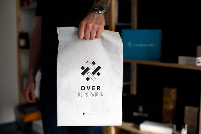
A simple polymailer bag is a durable and waterproof solution for something that's durable like clothing and other accessories.
Glass & Aluminium packaging
Glass is commonly used in food and beverage packaging. Although it is completely non-biodegradable, glass can be recycled pretty cost-efficiently, as it's free of any plastics and petroleum-based materials.
Glass is also limited in terms of package design. While various shapes can be formed, there aren’t any print options, aside from a traditional sticker label.
Finally, there is aluminium - a very light packaging material, which is mostly used in producing cans, bottles, mailer bags and some types of food packaging.

Design inspiration
Ok, so you've seen the critical components of quality product packaging design, it's time to get your creative juices flowing.
Here you'll see a wide range of unique designs of packaging, and you'll also see why these types of packaging are so good.
Innovative packaging supplies
Innovative packaging is coming along in leaps and bounds.
Whether it’s product packaging or sustainable packaging materials, innovative product boxes help show off your brand’s ingenuity and creativity.
As you can see in the examples below, transparent windows that use your raw product's texture is very common and will always be interesting!

Source: bored panda
Giving your packaging a second use is also a great way to innovate, as well as extend its life.
Below, you can see how the shoe brand Saucony used a blank white canvas as the centre point of a competition.
Saucony customers were encouraged to design their own shoe box on eco-friendly packaging, with a handful of winners having their designs printed on mass.

Click here to see how Saucony used product packaging to engage artists within their fanbase.
This concept from Saucony is a great example of tying innovative packaging box design in with marketing.
Minimalistic design
Minimalism is a design trend that favours bare forms, where nothing can be further removed without the expense of functionality, originating in Scandinavia and Japan.
We see minimalist design most often in the form of a simple logo:

Learn about Monsiedeur De Monde and the role minimalist packaging plays for the brand
From craft beer branding & wine bottle boxes to e-commerce shipping boxes, minimalism is a versatile and popular design trend.
It's an easy design concept to execute and a great way to cut design costs.
Take, for example, a cardboard box with a “handwritten” logo.
Minimalism is versatile and can work with most businesses, depending on the branding.
Design inspired by vintage aesthetics
Everything old is new again - or so the saying goes.
The term vintage is always hard to define.
For the sake of packaging, it's about channelling design elements that were common in the late 19th to early 20th centuries, around the time of the industrial revolution.
Many new brands like to use vintage elements in contemporary designs.
Vintage-style packaging is a cunning way of saying to your customer “We're the brand your grandparents loved”.
Many male cosmetics such as hair care and beard oils take this route too, as it appeals to a man's 'manliness'.
Captain Fawcett is a great example of a beard oil brand leveraging this vintage branding concept:

Part of this image conveys the trust that comes from decades of operation and selling time-tested, high end and well-loved products. The brown glass bottle dropper seems to have come from an old-timey apothecary.
Food products like chocolate, tea and coffee are regular users of the vintage aesthetic, often with a modern, contemporary twist.

Vintage design evokes nostalgia and creates an immediate impression of tradition and craftsmanship.
Pattern-based packaging
The human brain is hard-wired to notice repetitive patterns.
Pattern recognition can make our brains feel attached to something without a specific reason - so it’s pretty simple to see why using it on packaging can be effective.
Patterns can be used to create the feeling of a specific texture such as wood or fur.
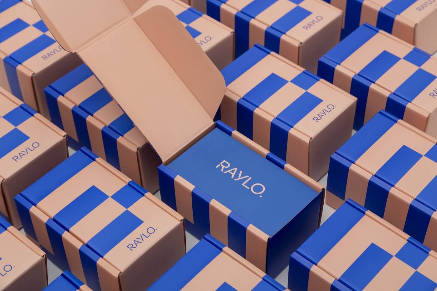
Disjointed shapes laced with colour or patterns that perfectly tessellate are just a few ways that complex and intricate shapes can be used on packaging.

If you want to use a specific pattern of your entire packaging, try designing on a box dieline. Packaging dielines make it easier to create high-resolution product boxes

Dielines are a great package design template, as it’s a flat, unfolded view of your box.
You can see every surface at once and create complex, intricate designs that take up every part of your blank canvas.
Culturally inspired design
Using shapes, patterns and imagery that is tied to a regional culture or people group is a great way to appeal to that niche, while remaining culturally sensitive yet aware.

Limited editions and products that tie into specific cultural holidays or celebrations take really well to packaging with similar themes.

Contemporary design and packaging
Contemporary is a tricky term to define, but in its most simple form, it’s a trend or fashion that’s happening here and now.
One contemporary packaging trend that’s becoming more common is an image or shape that’s spread over multiple surfaces.
One surface is complex and detailed, while the others have a lot less to look at. On the busy surface, contrasting colours are used to label the product and convey information.
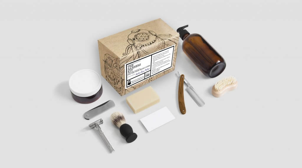
Source: barber's kit
This draws the viewer's eye to the busy area, while the less busy surfaces give the feel of space and openness.
Another contemporary element of the design is wit and humour.
Being a little cheeky, you might say...

Source: fruit twerk
Product shapes
Just as important to the graphic design of your product box is its physical shape.
There’s no point creating great-looking packaging for products if it doesn’t actually keep your product secure.
The most common form of packaging is usually a petroleum-based clear plastic wrap. This is horrible for the environment, and great if you don’t want your brand to be remembered.
Other common types of packaging products are:
- Single-walled cardboard boxes
- Corrugated mailer boxes
- Plastic clamshell packaging
- Mailing bags
Keeping the contents of your box safe and secure is crucial, whether you’re selling in a retail store, or sending your products to the other side of the planet.
Use a packaging filler to keep your products secure. Wood wool or custom tissue paper is a great solution that adds a little class and branding consistency.
Use packaging tape to safely secure your box or even better - use a corrugated mailer box with a self-adhesive sealing strip.

These boxes actually have two adhesive strips.
Why?
If your customer orders the wrong size product, or there's a fault, they can use the same packaging to safely and securely send it back to you!
Build an unboxing experience
Materials, design, shape - they're the most basic parts of custom packaging design.
Now, you need to bring them all together.
And the best way to pull all 3 of these elements together is to build an unboxing experience.
What is an unboxing experience?
An unboxing experience is a process that a customer goes through when they first get your product home.
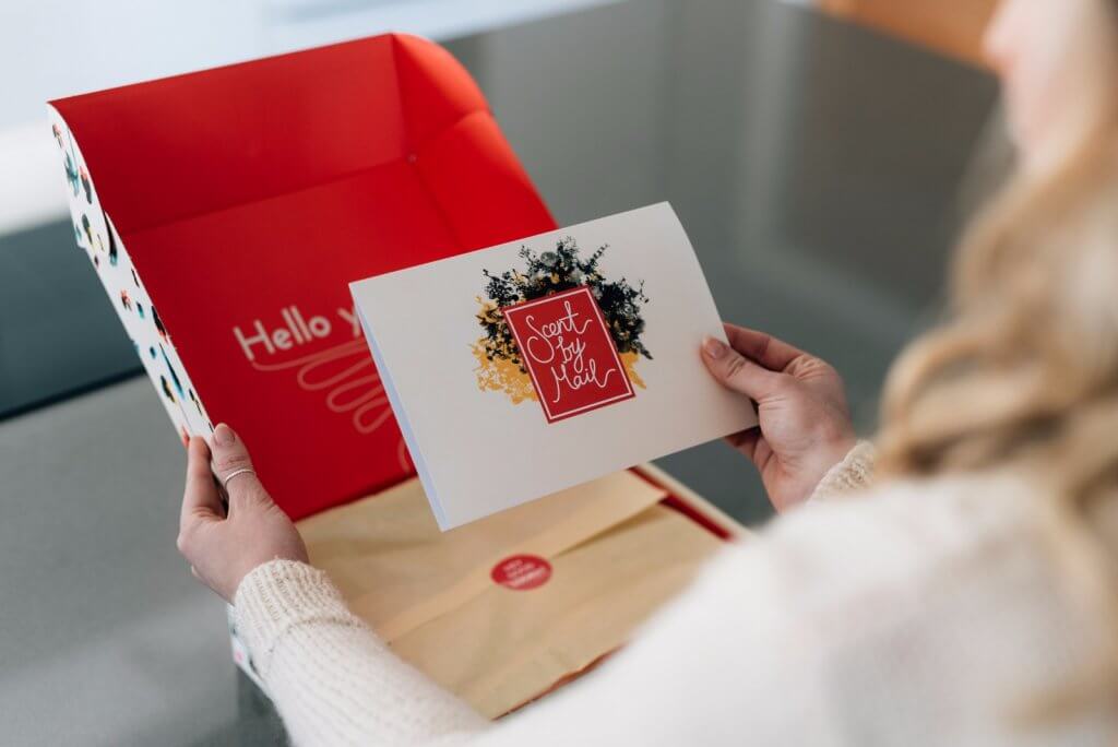
The attention being paid to your product (and brand) is at its highest.
This presents an opportunity to make a great first impression, say 'thanks' and blow your customer's expectations away.
No one remembers the brand that sells cheap phone covers on eBay.
Partially because they're cheap, disposable, and the packaging consists of little more than a clear plastic bag.
And chances are that if you're reading this section, your brand isn't like that.
Your brand offers value, and wants to deliver a product that solves a problem for a customer - and wants that custom to become a brand advocate.
And once you're selling a product that solves that problem, the unboxing experience is the way to turn them into a loyal repeat customer.
Want to learn more about designing an unboxing experience? Click here to read the article 'The Anatomy Of A Killer Unboxing Video: How and Why [Read now]'
Final thoughts
If you’re here, then it can only mean one thing - your brain is exploding with information.
As you can see, packaging design is a lot more than a simple plastic bag or cardboard box.
It's a powerful marketing channel, a facet that can give your brand the professional image that it needs to survive.
Packaging that is designed using the above information can help your brand stay on top of its game.
And believe it or not, Packhelp can help you with your packaging needs.
From cardboard boxes to rigid boxes with hot stamping, Packhelp has the best packaging solution for your brand!
Click here to browse Packhelp's range of custom packaging solutions or book a design consultation!


